Here's something that surprises a lot of first-time buyers: on a woven label, colour isn't free. Unlike a printed label — where a full-colour logo usually costs the same as a one-colour one — a woven label builds every colour from a separate thread in the weave. More colours means a more complex weave, and more cost.
The reassuring part: you need far fewer colours than you'd think. Here's how thread colours work and how to plan a woven logo that's both sharp and affordable.
How colour works on a woven label
A woven label is made by weaving coloured threads together — so your logo's colours are actual threads, not printed ink. Usually one colour forms the background, and the others form the text and detail woven on top. Because each colour is a separate thread, the number of colours directly affects how complex and how costly the label is to make.
The key difference from printed: on a printed (sublimation) label, full colour is usually free. On a woven label, each colour is a thread — so the palette drives the price.
How many colours you really need
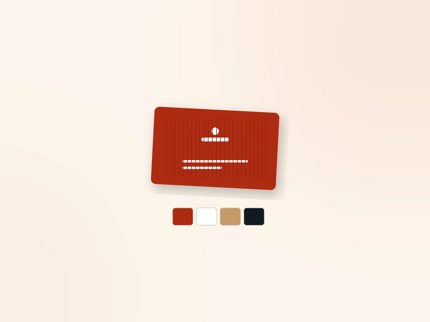
Most woven labels look clean and professional with two to four colours — a background plus one to three for the logo and text. A simple two-colour label (coloured background, contrasting logo) is often the most striking. Fewer, well-chosen colours usually read better and cost less than a busy weave.
Background vs detail threads
- Fills the base of the label
- Usually one strong colour
- Sets the overall tone
- Form the logo, text and fine elements
- Contrast with the background
- A few well-chosen colours
Thinking in terms of one background plus a few detail colours helps you plan a clean, legible label. A strong background with contrasting detail makes the logo stand out and read clearly, even small.
Keeping a woven logo sharp
- Focused palette — a few contrasting thread colours
- Avoid very fine text and thin lines that don't weave cleanly small
- Bold, simple shapes with good contrast reproduce best
- Choose damask for fine detail (see below)
- Always sample to confirm the logo reads at your size
Colourful logo or gradients? A very colourful logo adds thread and cost and can lose sharpness at small woven sizes. If colour is essential, either simplify the palette to the key colours, or use a printed or satin label which reproduces full colour cheaply.
Damask for fine detail
A damask weave uses finer threads and a tighter weave, rendering more detail than a standard woven label — ideal for intricate logos, crests and small text. If your logo has fine detail you want to keep in a woven format, damask is the better choice; for simpler logos, standard woven reproduces them well at lower cost. Compare them in our woven vs damask guide.
The short answer
On a woven label, every colour is a separate thread, so colour count drives both the look and the cost — unlike printed labels, where full colour is usually free. Most woven labels look clean and premium with just two to four colours: a background plus a few contrasting detail threads. Keep the palette focused, avoid very fine text, and choose damask for intricate detail. If your logo is very colourful, simplify it or use a printed label. Always sample to confirm your logo reads sharp. Send us your logo and we'll advise the ideal thread palette.