
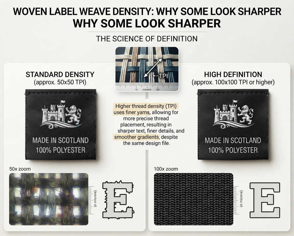
Sharpness in a woven label isn't luck and it isn't magic. It's density — how many threads, and how fine, are packed into each label. Get density right and small text stays readable and curves stay smooth. Get it wrong and your logo turns blocky no matter how good the artwork was.
This is the one spec that most separates a premium woven from a cheap one, and once you can see it you'll never un-see it.
What weave density actually means
Weave density is simply how many threads are packed into a given area. It's described by two numbers — ends and picks:
The lengthwise warp threads across a set width. More ends = finer resolution left-to-right.
The crosswise weft threads along a set length. More picks = finer resolution top-to-bottom.
The more ends and picks you pack in — and the thinner each thread is — the higher the density. (If those terms are new, our guide to how woven labels are made explains warp and weft from scratch.)
Think of it like screen resolution
The cleanest way to picture density is pixels on a screen. A low-resolution screen draws a curve in big, chunky steps; a high-resolution screen draws the same curve smoothly because it has more, smaller pixels to work with. Threads are the label's pixels.
This is exactly why damask looks sharper than standard woven — it's the same process at a higher thread count with finer yarn.
Why higher density costs more
Density isn't free. A denser weave uses more thread, finer yarn costs more, and the loom runs slower because it has to insert more picks per centimetre. All of that adds up, which is why high-definition and damask labels sit above standard woven on price.
Density is a lever, not a virtue. A bold, simple logo with no small elements looks perfectly sharp at standard density — paying for damask there is wasted money. Spend on density only where the detail demands it.
When you actually need high density
Reach for a higher-density weave when your design has fine elements that a standard weave would swallow.
- Your logo has small text or size codes
- There are thin lines or delicate serifs
- The mark has fine registration between colours
- It's a premium fashion neck label people inspect
- The logo is bold and simple
- Text is medium or large and clear
- It's an internal label seen only briefly
- Cost per label is the priority
Density can't rescue bad artwork. If your file has hairline strokes below what any loom can weave, even damask will lose them. Get the artwork loom-ready first — see woven label design rules.
How to judge density in your hand
You don't need the exact ends-and-picks numbers to spot quality. Look at the label's own tells:
- Small text — on a dense weave it stays open and legible; on a loose one the counters fill in and letters merge.
- Curved edges — smooth on a dense weave, visibly stair-stepped on a loose one.
- The back — a good weave has a neat reverse where the design is faintly readable, not a tangle of loose floats.
- The feel — run a fingernail across it: dense feels smooth and firm, loose feels rough or flimsy.
The only test that never lies is a sample of your own artwork. Density reveals itself where your detail is finest, so inspect the smallest elements on a physical sample before you approve bulk. It's also your chance to compare a QC pass — see our QC checklist.
The short answer
Weave density — the ends and picks, and how fine the yarn is — is the spec that most decides how sharp a woven label looks. More, thinner threads work like more pixels: crisp edges and readable small text. Fewer, coarser threads look blocky. Damask is just woven at higher density, which is why it's sharper and costs more. Use high density where your design has small text or fine detail; standard density is plenty for bold, simple logos. And whatever the numbers say, judge it on a physical sample of your own artwork — that's where density shows its hand. Send us your logo and we'll recommend the right density and weave it so you can see it for yourself.