Bad artwork is the single most common cause of a disappointing label order. The logo looks blurry because it was pulled off a website. The colour is too bright because it was designed in RGB. A word gets trimmed off because there was no bleed. None of these are the supplier's fault — they're artwork problems, and they're all avoidable.
Get the file right and your bulk run comes out exactly as you pictured. Here's the checklist, in plain English, for anyone who isn't a print designer.
Send vector, not a screenshot
- AI, EPS, PDF or SVG
- Scales to any size, stays razor-sharp
- Essential for small labels & fine logos
- JPG / PNG — made of pixels
- Blurs when scaled up
- Only OK if 300 DPI at final size
The #1 mistake: a low-resolution logo copied off a website. It looks fine on screen but prints blurry at label size. Always start from the original vector logo.
Resolution: 300 DPI at final size
Vector artwork has no DPI — it scales infinitely, which is why it's preferred. If you must send a raster image, it needs to be at least 300 DPI at the actual finished label size, not a big image scaled down. A logo that's 300 DPI at 5 cm will not be 300 DPI when stretched to fill a larger label.
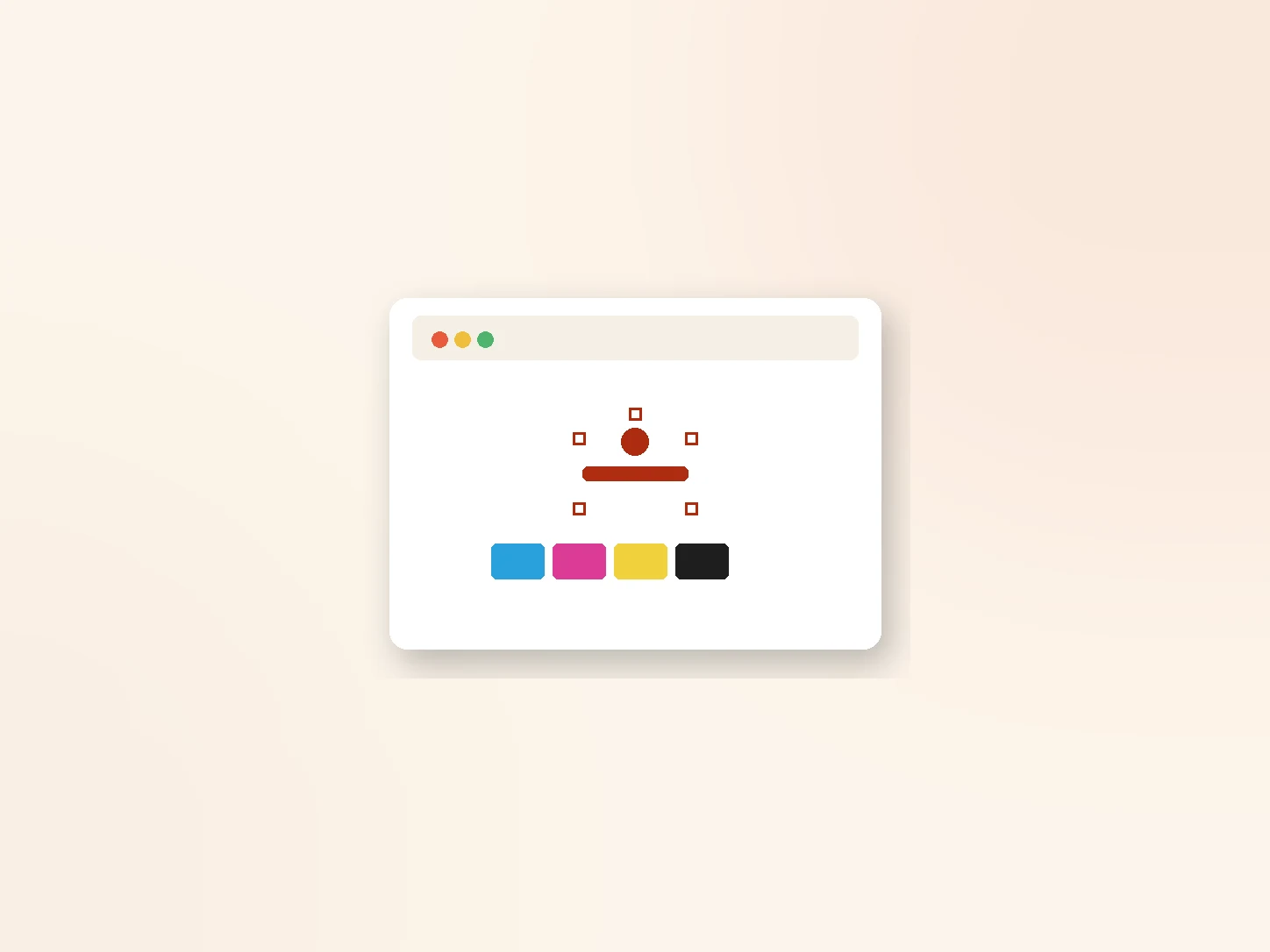
Colour: CMYK & Pantone, never RGB
- CMYK is how labels actually print
- Pantone (PMS) locks your brand colour
- Approve a physical sample
- For screens, not print
- Looks brighter than the result
- Leads to "it's not the colour I saw"
For woven labels, colours are matched to thread shades rather than ink, so a Pantone reference plus a physical sample matters even more. Never approve a brand colour from a screen alone.
Bleed & safe area
Bleed is a small margin (about 2–3 mm) of artwork extending past the cut line, so a slightly-off trim never leaves a white edge. Anything that should reach the edge needs bleed. Keep important text and logos a safe distance inside the cut line so nothing gets trimmed off.
Two simple rules: extend backgrounds past the edge (bleed), and keep logos and text well inside it (safe area). That's most trimming problems solved.
Outline your fonts
If you send a file with live text and the supplier doesn't have your exact font, it can reflow or swap to the wrong typeface. Converting text to outlines (curves) or embedding the fonts locks the type exactly as designed. Always outline fonts on final artwork.
What to send your supplier
Vector (or 300 DPI raster at final size), fonts outlined.
Finished size in mm, material and fold.
Pantone references + CMYK artwork.
Quantity and any special finish.
Send a complete brief up front and you'll get an accurate quote and a right-first-time sample — no back-and-forth. For sizes, see our label size guide; for folds, our fold types guide.
The short answer
Set up label artwork right and your bulk run comes out perfect. Send vector files (AI/EPS/PDF/SVG) or a 300 DPI raster at final size, work in CMYK with a Pantone reference for your brand colour, add 2–3 mm bleed and keep text inside a safe area, and outline your fonts. Give your supplier the artwork, finished size, material, fold, colour references and quantity in one brief — then always approve a physical sample before bulk. Send us your files and we'll flag anything before it goes to production.